VAGARO
Leveraging AI Prototyping Tools to Bring a Homepage to Life
How I reimagined the Vagaro homepage to reduce cognitive load and highlight high-priority business insights through AI tooling.
ROLE
Design Lead
TEAM
Kiran Kaur (Product Manager)
TIMELINE
Jan 2025 - Jun 2025
OVERVIEW
Vagaro's software and various features can create an overwhelming experience for users, leading them to feel like the product isn't made for them. As the lead designer, I led a homepage redesign leveraging user research and AI tooling to simplify data access and boost engagement.
I led the redesign of the mobile home experience by:
Leveraging AI to surface high-priority business insights.
Building a standardized charts library for clearer data visualization.
Integrating goal-tracking loops to drive merchant growth.
01 | BACKGROUND
Most of our users don’t know how to navigate our reports
Vagaro is a powerhouse of data, but most of that value was buried under layers of navigation. We noticed a frustrating trend: users were only sticking to the two or three reports they knew well, while the rest of our insights gathered virtual dust.
Additionally, our support team is consistently flooded with calls from users asking for features or data points that already exist. The information was there, but the cognitive load required to find it was too high. This suggests that there was some problem with navigating around the different reports.
02 | BRAINSTORMING
Cross-functional teams gave more insight on the specific pain points that users faced.
To make sure I wasn't designing in a vacuum, I brought in people who talk to our users every day: Support, Sales, and Account Management. We broke into groups to understand our different "personas"—from the solo entrepreneur to the large franchise owner.


Make the data easy
Users should be able to visualize charts easier, in the way they want. The solo entrepreneur doesn't care about the same data points as the large franchise owner.
AI-Driven Approach
Instead of random pop-ups, we could use a business's own data to recommend specific tools that would solve their current bottlenecks.
Goal Setting + Tracking
Data is boring without a goal. By adding goal-setting, we could transform the dashboard into a tool for retention and user engagement.
03 | COMPONENT DESIGN
Elevating Data Visualization for Clarity & Scale
Vagaro’s old charts were a major source of friction. They felt dated and cluttered, making it hard for business owners to understand their insights at a glance. But the bigger problem was that we had zero chart components in our Figma library. Every designer was essentially designing charts from scratch, leading to inconsistencies across the software.
I stepped in to create our first chart components within Figma, using variables to allow designers to toggle between data states, timeframes, and chart types instantly.
A library is only as good as its implementation. I also worked with our React developers to ensure that our code library mirrored our Figma components 1:1.
04 | CHANGE IN SCOPE
A dashboard wasn't necessarily the answer.
As I dug into the research, I realized that just updating the reports wouldn't necessarily fix the core problem. If a user is feeling overwhelmed, that doesn't extend just to understanding their business data.
I proposed a change in scope: from a simple dashboard update to building a new homepage experience:
Simplify the Data
Instead of showing all the data, we can use the homepage to surface the most frequent actions and "at-a-glance" metrics. By highlighting the essentials, the software would feel lighter and more approachable.
A Strategic Partner
By leveraging AI to analyze a business, we could turn the homepage into a strategic partner. If their bookings were down, the homepage would suggest a marketing tool. If they were growing fast, it would suggest staff management features.

05 | VISUAL EXPLORATIONS
With a broader scope, I had the freedom to rethink Vagaro’s visual language.
My goal wasn't just to make it look better, but to make the homepage a tool for user engagement.
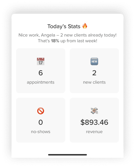
I explored gamification and positive reinforcement by visualizing business growth through interactive progress rings and "streak" indicators. This ranged from in your face animations that went heavy on the gamification to more subtle progress bars.
Since most of our pros are managing their business from their phones, I prioritized the mobile experience. I explored how modular "cards" could stack and reorganize themselves based on priority. This is where the AI logic can really shine—the homepage can show the specific task that matters most in that exact moment.
06 | DESIGNING WITH AI
Leveraging AI to Accelerate High-Fidelity Prototyping
To bring the homepage to life quickly, I wanted to integrate Figma Make into my workflow. However, my experience with AI tools has taught me that while AI is great at the creating for "big picture," it often misses the mark when things get hyper-specific.
Since I had already established the core visual design and modular widgets, I used AI as a builder. I added each homepage widget as a standalone prompt, ensuring that each one was functioning correctly before moving on to the next one.

This allowed me to move faster without sacrificing the integrity of the design.
I used that extra time to focus on the details. Instead of handing off static screens, I was able to build high-fidelity, interactive prototypes that actually felt like a finished product. I could experiment with how a chart "grows" when the page loads or how the numbers go up in real-time.